


In Living Colour
In the closing months of 2020, a photobook from Merrion Press, Old Ireland in Colour, sold 48,475 copies, grossing almost €1.14 million1 – an amazing feat given the relatively small market that Ireland’s population of 4.9 million provides. The book features nineteenth and twentieth century archival photographs of Ireland sourced from major national collections and colourised by John Breslin using DeOldify software. Accompanying the images is a text by historian Sarah-Anne Buckley. The trend for such colourisation is not limited to Ireland, with works such as Dan Jones and Marina Amaral’s The Colour of Time: a New History of the World 1860- 1950 (2018), prefiguring the success of this Irish title.2
In my capacity as a photo-historian, I have argued on national radio against the colourisation of World War One newsreels, but I am cognisant that such arguments against colourisation could be construed as elitist.3 Surely, educators and historians should be delighted to see the medium of photography being enjoyed by as broad a range of people as possible. Many of those undertaking colourisation are dedicated and talented and this critique is not directed towards their individual work. Nonetheless, undertaking this activity with the pretence of ‘restoration’ or of bringing the photograph or film closer to ‘reality’ raises certain issues. When an individual colourises a photograph, it is their own concern. Whilst I embrace collage, mash-up, and other creative interpretations of existing cultural objects, I do feel that they should be clearly framed as reinterpretations. When this is sanctioned by institutions and academics, it moves into more troubling territory. Should archives and museums permit the altering of primary historical sources? Do such projects represent a failure to accord the photograph the status given to other primary sources? As a primary source, shouldn’t a photograph be subjected to the same scrutiny and respect as a manuscript? Is there an onus upon institutions and academics to honour aesthetic choices, such as framing and tonal qualities, as made by the photographer? Should historians disassociate photographs from the technological, industrial, and artistic systems in which they were created? Why do these older images need to be ‘improved’ upon? What does that say about our levels of visual literacy that we need to have images brought up to date? Ultimately, it raises the wider question around how historians are trained to approach the visual.
Early on in their education, historians learn to scrutinise sources asking how the inherent biases, restrictions, and sensibilities of an era inform a document’s creation and subsequent interpretation. When we encounter a script, novel, or poem we accept the author’s careful selection of words and that the order in which they appear was explicitly chosen. Photography too has its own language, which leads us to question why many academics fail to apply the same levels of rigour to their visual sources. Whenever an original document is altered, we are in danger of obscuring how and why it was created in the first place. We know that the original remains intact, but the online circulation and mass-dissemination of colourised images can result in the surrogate gaining primacy over the original.
Those who undertake colourisation stressing the accuracy of their colour choices and this obsession with realism, is perhaps one of the more perplexing aspects of contemporary colourisation. It is true that the colour of an army uniform can be checked against existing examples or an individual’s passport consulted to verify their hair or eye colour. This fails to recognise the many variables of daylight or an object’s condition that could alter what things actually looked like on the day that the photograph was taken. The wider question is whether any photographic process can accurately reproduce the world? Each colour system can only approximate what the human eye can see. Any exploration of this territory veers as much into the philosophical realm as it does the technological. What we do know is that all photography is a technologically mediated record of the world, complete with that technology’s strengths and weaknesses. It can only ever be a semblance, imbued with the peculiarities of that process. Each photograph is a product of the time and place in which it was made. It looks a certain way not only because of what it depicts, but also because of the technical and aesthetic choices made during its production and, just as importantly, the photographer’s vision and prevailing artistic trends.
Many of the reviews for books using colourised photos use phrases like ‘bring to life’, ‘restore’, and ‘rediscover.’ Following the release of Old Ireland in Colour, Breslin discussed his own view of the impact of his work on these historical images: “It’s staggering the difference it makes seeing images — even familiar ones — in colour. Flesh-toned faces become full of personality; the texture of fur and wool jumps into focus; details in the background spring to life”.4
During this discussion, reference is made to a colourised image of two boys from 1963 – praising its compositions and importance as a historical document. The reader is not provided with a view of the original nor are they made aware that the image was made by acclaimed documentary photographer Elinor Wiltshire. Wiltshire has noted that her aesthetic choices stemmed from her knowledge of the medium, and that her decision to use a Rolleiflex camera with black-and-white film was a deliberate and informed one. In projects such as Old Ireland in Colour, the role of the original photographer becomes subordinate to the colouriser, whose vision purports to improve upon the original. To imply that all historical photographs are monochrome due to a lack of availability of colour, reveals a limited understanding of the history of photography. Throughout the twentieth century, and indeed into the twenty-first century, photographers deliberately rejected colour processes, feeling that the gradations and contrasts obtained from silver gelatin prints were more suited to their specific vision. Throughout the twentieth century, black and white photography was synonymous with the documentary tradition and its evidentiary and ‘truth’ traits were extolled. From the 1960s and 1970s on, conceptual photographers embraced colour, moving it out of the realm of the vernacular, advertising, and travel photography. Whilst much of the rhetoric against colour photography was grounded in a type of snobbery or artifice, it also tells us that the reception and perception of what photography can and should be is fluid and ever-changing.6 We cannot know what Robert French, who created much of the National Library of Ireland’s Lawrence Collection, would think of the colourisation, he very may well have been in favour of it. But what we do know is that many photographers deliberately opted for black and white even when colour options were widely available.
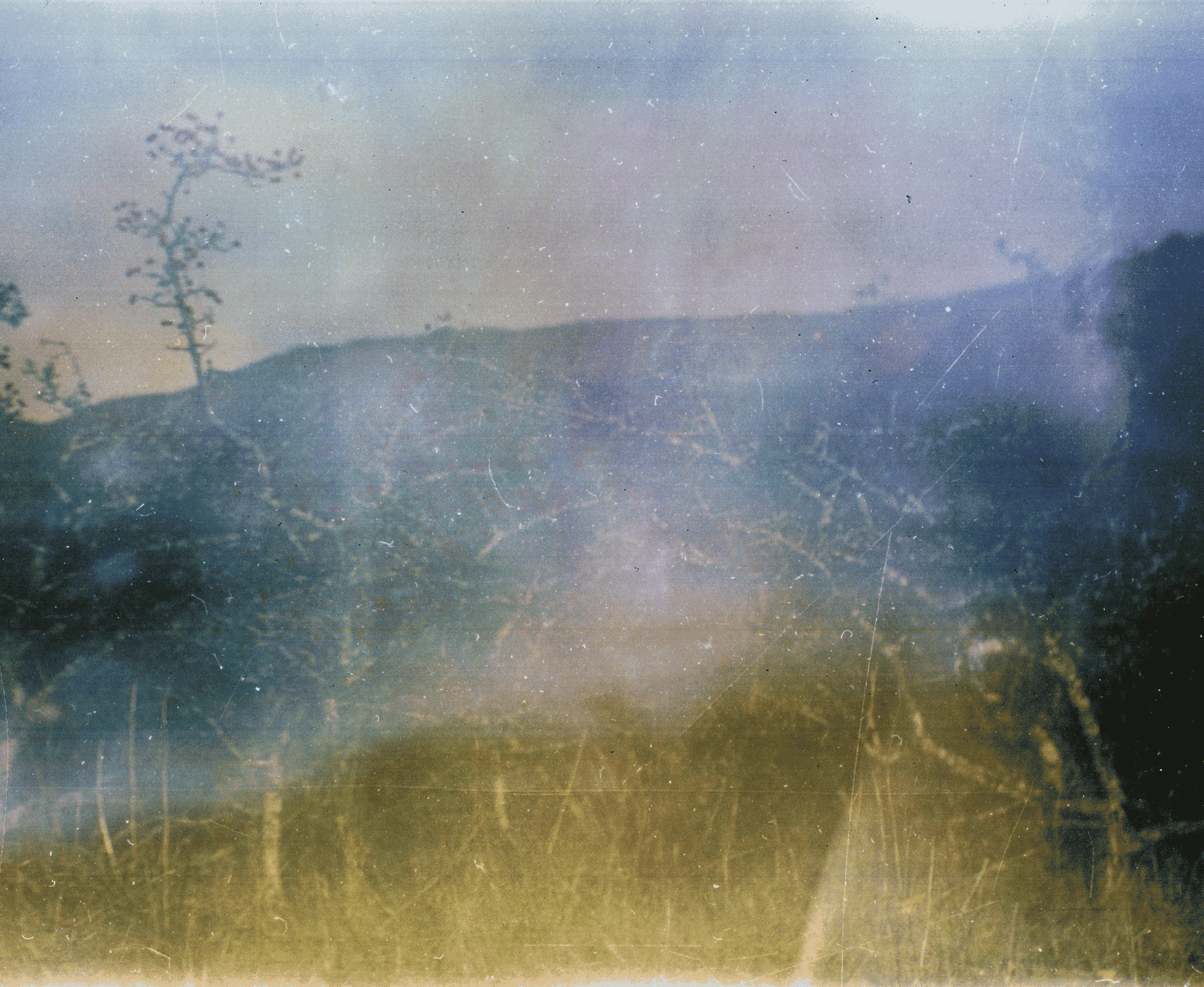
There is, in the work of John Hinde (1916-1997), a precedent for depicting Ireland through vividly enhanced colours. Hinde’s garishly coloured postcard representations of Ireland sold in their millions, being described by Ceri Price as “hyper-coloured, just past, comforting fictive spaces”.7 Unrealistic blue skies and seas were combined with heightened greens and reds to present the country in tones and hues that differed greatly from most experiences of the Irish countryside. Nonetheless, these creations were consumed and internalised by visitors and locals alike. In many ways, they represented a modern, bright, new nation, one that was attempting to leave the past behind and step into an idealised future. Whilst Hinde’s photographs were not colourised versions of pre-existing black-and-white imagery, they do reveal an existing capacity to accept and consume highly manipulated and unrealistic colour depictions of Irish landscape and place. They also showcase the importance and impact of contemporary aesthetic decisions by image-makers.
The rationale for many colourisation projects is the presumption that the quality of monochrome images is inferior and lacking in nuance and subtlety. Peter Geimer’s research states there is little evidence that nineteenth century photographers were overly concerned about the lack of colours.8 Many accepted it as a feature of the medium, embracing the subtle difference in the tonality between, let’s say, a toned albumen print and a platinum print. It is important to contextualise the development of colour as being on the same continuum rather than being on a separate spectrum.
The lengthy history of colourisation, from studio hand tinting to additive processes or overpainting, is part and parcel of the medium’s development. These processes were not always undertaken in the belief that a colour photograph was superior to their black and white contemporaries nor represented a nearer approximation of truth. Colour processes signify and evoke, in a very particular way, the era in which they were created. Our enjoyment of cinema is intrinsically linked and bound up with the film stock, from the bright Technicolor of a 1950s musical to the shadows and contrast of a film noir. Perhaps, the palette of colours applied by today’s colourisation software will become synonymous with the 2020s?
Colourisation software packages emphasise how complex algorithms and the application of Artificial Intelligence accurately reveals the ‘true’ colours of what is depicted by applying deep learning techniques. After analysing millions of colour images, to recognise where and when certain colours occur, these traits are then mapped and linked onto grayscale images and the ‘correct’ colour applied. This technique is dependent upon the quality and diversity of the source colour images from which the learning was derived, which means biases regarding race, class, and gender are being rebuilt into images. A recent experiment by Gwen C. Katzs demonstrates how this process can fall substantially short. Colour photos by Sergey Prokudin-Gorsky (taken between 1909 and 1915) were desaturated and subsequently colourised. The resulting images saw their vibrancy and vividness being replaced by muted pastel hues.9
Other elements can venture into difficult ethical territory, seen recently in the application of colourisation and ‘smile’ software by Matt Loughrey. Loughrey manipulated photographs of victims of the Khmer Rouge, claiming that his additions of colour and smiles humanised those shown in the photographs. Following complaints, an article featuring the work on Vice magazine’s site was taken down, and the Cambodian government have urged “researchers, artists and the public not to manipulate any historical source [out of] respect [for] the victims”.10 His actions are indicative of how a lack of consideration for the photographic document can coalesce with the application of these technologies.
Not all colourisation activities result in such negative outcomes, and the process can be used to strongly evoke particular eras; to playfully interrogate the medium or to subvert photography’s colonial gaze. The colourisation of monochrome images is embraced by many contemporary artists in an instrumental and considered manner. South Sudanese artist Atong Atem employs the techniques of hand painting to reclaim the ethnographic imagery of the past. Atem’s interventions on older colonial black and white images is about “taking photographs made by the colonisers and making my own thing with them”.11 Her interventions are both deliberate and obvious, but also look to create a secondary record that lives alongside the original without replacing it.
Colourisation techniques have a place within the wider canon and history of photography, modern applications of these techniques should look to add value to the conversation. Instances where we simply add colour without considering the value of what is lost will result in instances where an addition becomes a subtraction.
Image above by John Hinde
1 Martin Doyle, ‘John Delaney exposé top title as Old Ireland in Colour makes €1m sales,’ Irish Times, 5th January 2021.
2 For a review of this publication see Elizabeth Edwards, ‘The Colour of Time: a New History of the World, 1850-1960,’ Journal of the History of Photography, 2019, 43:3, 331-332.
3 The History Show, RTE Radio One, Sunday 13th January 2019. Link
4 Chrissie Russell, ‘Connection to our past - how an Irish account that brought colour to history has gained a cult online following,’ Irish Independent, 18 October 2020.
5 Elinor Wiltshire and Orla Fitzpatrick, If Ever you go to Dublin Town, Dublin: National Library of Ireland, 1999.
6 See the following for a discussion of colour photography’s adoption in 1970s art photography: Sally Eauclaire, The new color photography, New York: Abbeville press, 1981.
7 Ceri Price, Postcards from the Old Country: Finessing the landscape to fit our fables,’ Literary Geographies, 1(2) 2015, pp. 155 173.
8 Peter Geimer, ‘The Colour of Evidence: Picturing the Past in Photography and Film,’ in Mitman, Greeg and Kelley Wilder (eds.), Documenting the World: Film, Photography, and the Scientific Record, Chciago: University of Chicago Press, 2016, pp. 45-65.
9 Twitter Link
10 Tom Seymour, ‘Manipulations of smiling Khmer Rouge victims prompt Cambodia to threaten Vice media with legal action,’ The Art Newspaper, 15th April 2021. Link
11 Wendy Syfret, ‘Atong Atem on confronting photography’s colonial past,’ I-D, 25TH January 2017.
Find out more about Orla Fitzpatrick's practice at instagram.com